The livery launch season is behind us, we are sure that these launches have done one thing perfectly. To get everyone excited about F1 in 2023. Now rather than talking about how Max Verstappen will take over and win his 3rd straight title before the mid-season break begins will surely take the mic out of everyone so let’s rather focus on the overpriced coffins and the way they looked.
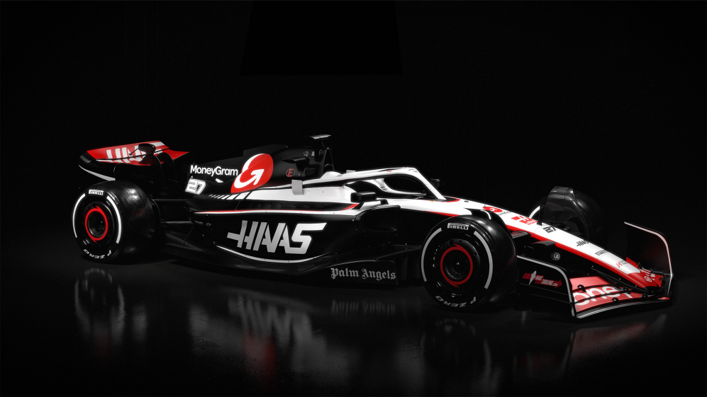
Starting Chronologically, the first team to get us into the hype was Haas F1. There wasn’t much of a show to be honest. It was just photos on the social media handles of not even the real 2023 car but did give us an opportunity to gaze onto the new title sponsorship with MoneyGram will look like. If you looked at the car from the front straight on, it may not even differ from last year’s car. But when you look at it from the side, the slick black colour pops in and makes the car look oh so better. Sure its just bare carbon and it is done to reduce weight of these heavy boys. The black colour adds a slickness to the car which was missing until now.
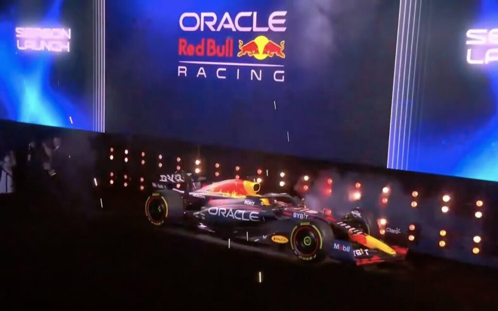
Oracle Red Bull Racing were next with quite honestly the worst launch of all time. The reigning world champions made a big deal about their party launch in New York. It was LONG show which was getting irritating very quickly. They of course had some Red Bull athletes who belong from array of adventure sports and were talking about everything other than F1. And after almost about 2 hours they revealed the same car. No change whatsoever. However the Red Bull Ford partnership was announced. It did kind of kill anticipation for what will be undeniably the title favourites in 2023.
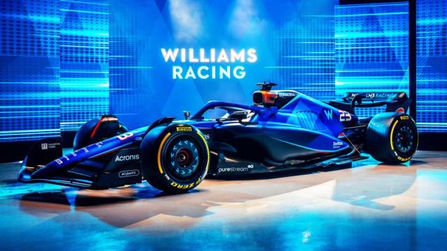
Williams revealed their car which had the best Duracell sponsorship integration we have seen in a while. Overall this was also the identical livery as last year although the finish has gone from glossy to matte. It somehow looks better even if it is the same car. Immediately it was noticed that the no side-pod design was ditched this year and also new gulf sponsorship was announced and also the dark mode theme was evident here as well.
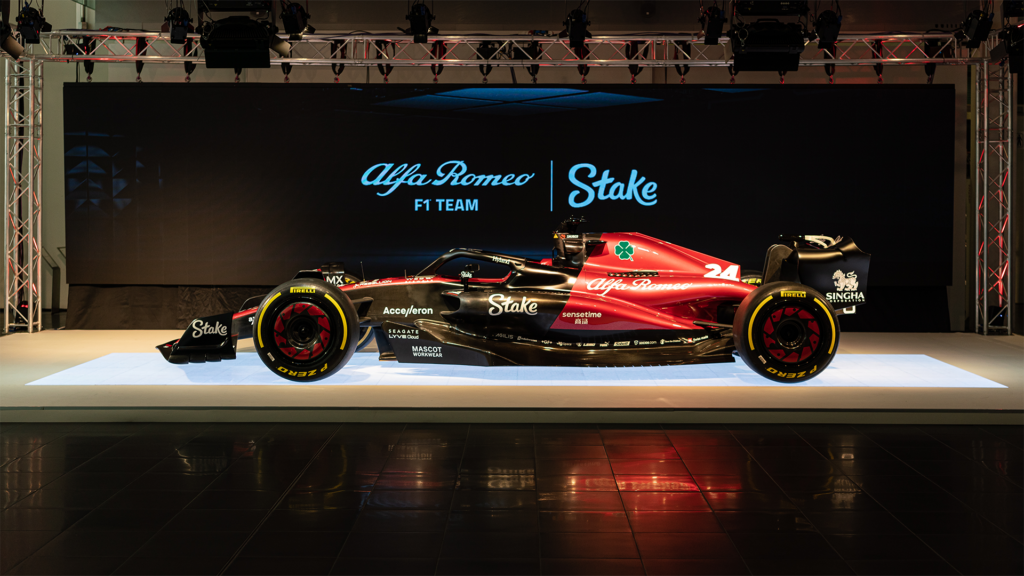
Alfa Romeo was the next and they had one of the best liveries last year with the glorious white and red livery. This year the white is replaced with Black bare carbon fibre. All in all, it is a fresh look which has diluted but still looks fresh as ever and as they say, if it ain’t broke why fix it?
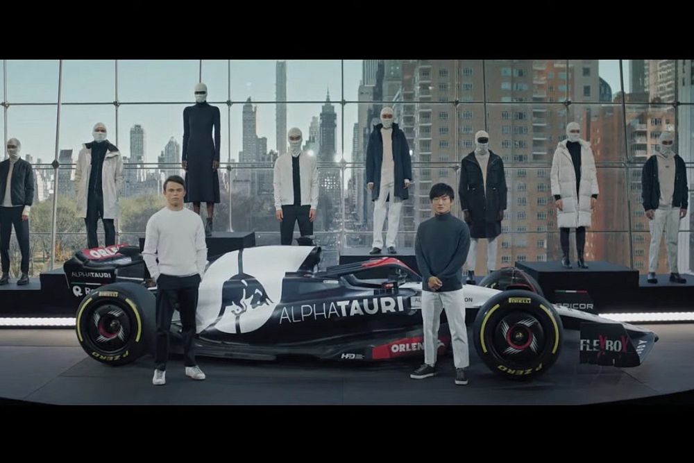
AlphaTauri had the shortest livery launch In New York and was the complete opposite of their sister team. We were expecting a full-on fashion show but it was just the clothing line behind the F1 car. The livery was more or less the same with the new Orlen sponsorship which looked a bit of an afterthought but the creative white design on the wheel cover does look quite good.

McLaren launched their MCL60 to mark 60 years of McLaren competing in F1. Overall, the similar papaya and blue livery is amazing and with more hints of black looks amazing. The awesome google chrome sponsorship on the wheel cover looks just perfect
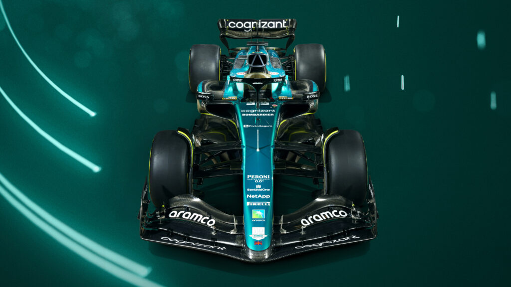
The thing with McLaren is they appeal to their fans, and it is evident in the way they appear when they do launches. Aston Martin launched their beautiful AMR23 and gave the exact opposite vibe almost reminding of McLaren’s Ron Dennis Era. The beautiful yet elegant green with the racing lime and hints of black was pretty much the same. this consistency is what makes the Aston looks so good. I am sure Fernando would agree.

People on 14th February probably go on a date and enjoy valentine’s day. F1 fans who are single, reminisce with Ferrari trying to make sense of their existence. And oh boy they did it in the best way with “Tifosi” style merch from the 2010s. The new White Accents and “Ferrari” written on the rear wing looks beautiful with added carbon fibre.
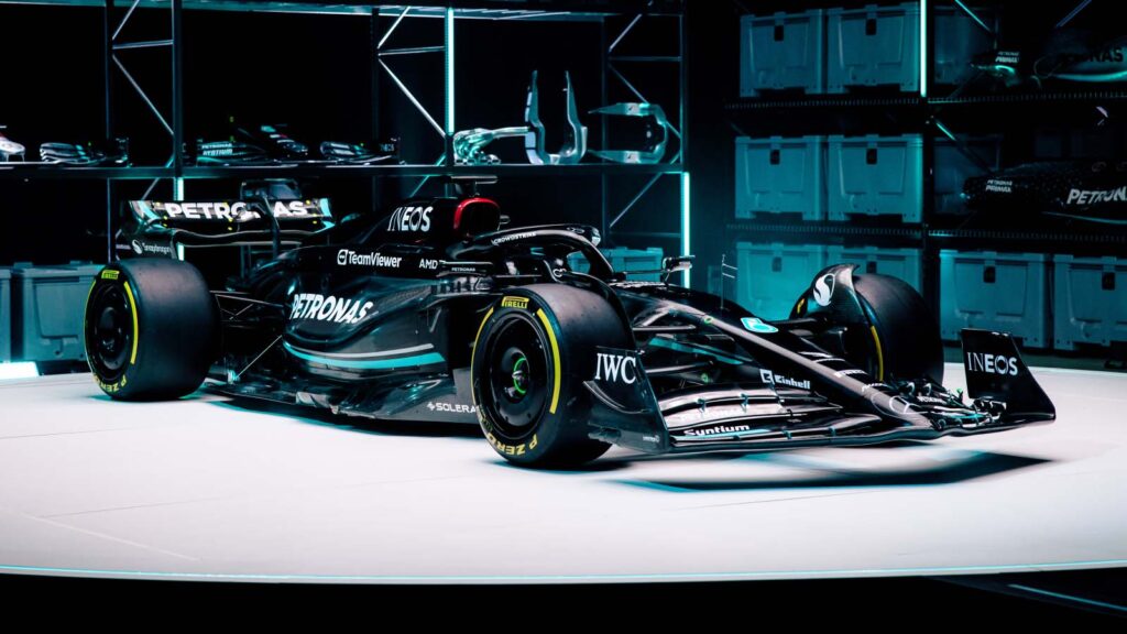
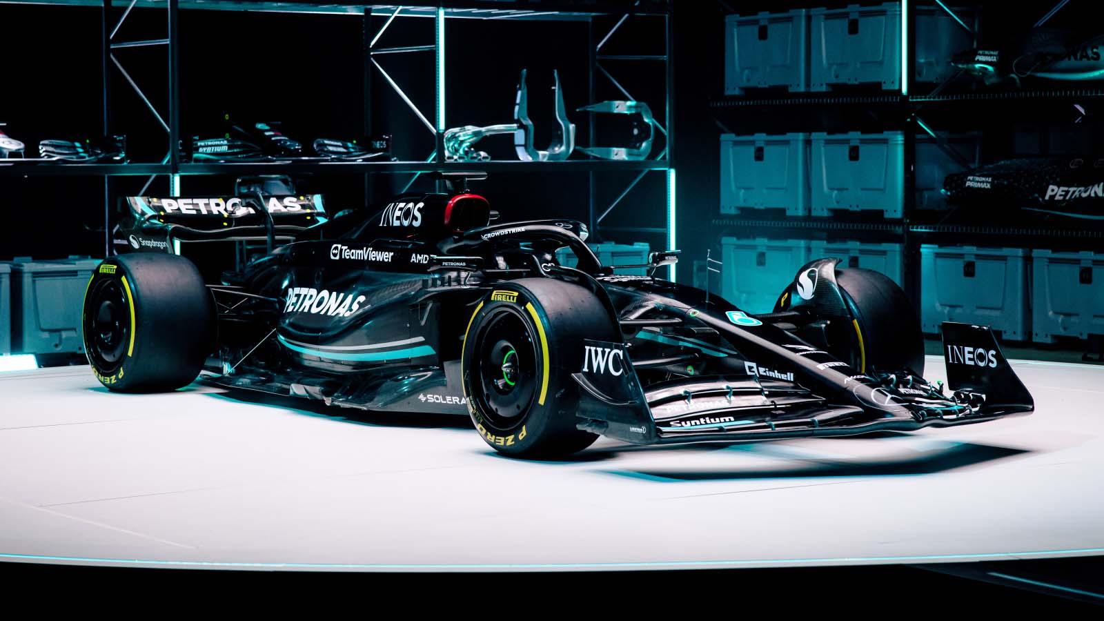
We have talked about Dark Mode this and Save weight that. The silver arrows decided to black arrow themselves this year. This car which looks literally like a Vantablack BMW X6 with turquoise stripes looks drastic and one of the best looking liveries even if it is simply black to give Ferrari a run for their beautiful red. With green accents for George Russell and the continuing the no side-pod design. They are properly looking as if they can legitimately challenge redbull and we cannot wait for it.

Alpine are the last team to announce its livery. Which is more or less the same. Also, two liveries were revealed: one was completely covered in bubblegum pink and one had the original Alpine blue chassis with the same pink used as highlights over the front wing, side-pods, fenders and rear wing. These look similar to last year with added black to save weight. Esteban and Pierre’s friendly banter was there to fill what was a very good end to an incredible launch season. All we can say is we cannot wait for pre season testing! coming to you March 5th 2023.

